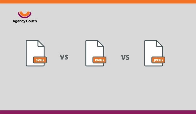
Image formats, as you know, are an integral part of the virtual visual world that we live in. From social media to digital billboards, we use them everywhere. Choosing the most suitable type of image for different purposes has to be one of the most tricky tasks here.
When it comes to websites, SVG file format is a real-life-saver. While developing a website, you need to take care of many aspects, especially from a user’s point of view. And today, there are many kinds of devices that users use for accessing the web. To ensure optimum performance on every device, you must select elements that not only appear the same in every size but also, take almost equal time to load.
Coming to the point, SVG format is ideal for web pages. Not only because it is smaller in size, but there are many other factors too that make it superior to its counterparts. Let’s talk briefly about the difference between the most commonly used image file formats first.
SVG Vs PNG Vs JPEG
JPEG/ JPG:
Joint Photographic Expert Group (JPEG/JPG) is the most popular image format. JPEGs are raster images that use tiny pixels. Every image has a fixed number of pixels. So, when you zoom in on a picture you can actually see square-shaped dots.
JPEG files are small and can be easily uploaded on any platform. The majority of cameras, by default, save photographs in this format. Even though these files take less space and are quick to load, the quality of the image is compromised when scaled up. Besides, if you compress the file or convert any other file to JPEG, some information and image quality is lost.
PNG:
PNG or Portable Network Graphics are also raster images. PNG files are usually larger and allow editing for complex images. Unlike JPEG, the images in this format are lossless. This image format is also ideal for creating animation and complex pictures. But for a website, it substantially increases the load time and hampers its performance.
Find out more on JPEG vs PNG here.
SVG:
Scalable Vector Graphic is an XML-based vector image format that uses geographical instructions. These graphics consists of anchored dots connected by lines and other shapes. Since SVG is lossless and can easily be rendered to any size, it is an ideal format for responsive websites.
So, if you are not already using SVGs in your web designs, here are the reasons why you should start doing that now.
Reasons Why You Should Prefer SVGs Over Other Image Formats
The SVG files are relatively small in size, which automatically makes this format the most likable for websites. But that’s not it. Let’s dive in and check out some more benefits of vector graphics.
Resolution is Not The Limit
SVGs are actually resolution-independent. In raster file formats, the resolution is the deciding factor for the quality of an image. If you have to scale your image, you would need to squeeze more pixels into it. So, when the image is zoomed in for any reason, it doesn’t look distorted or blurry.
On the other hand, since SVG is pixel-free, image scaling wouldn’t be a concern. The image that would look pixelated and blurry upon scaling in JPEG or PNG would retain the quality in SVG. It happens because the instructions in SVG remain the same no matter what the size is. So, practically it is a one-size-fits-all solution.
This is particularly beneficial in two ways:
- No matter what device and screen size the user opens your website in, it won’t hamper the picture quality.
- You won’t have to prepare various image files of the same picture for different screen sizes.
Read more about various image file formats here.
Smaller File Size; Greater Speed
By now, it is quite clear that SVG files are way too small when compared to their counterparts. This small size with a great scalability factor is an absolute winner.
When you work with PNG or JPEG files, you have to ensure that you upload the largest size possible to the server because these images do not scale like they do in vector format. These large files take their whole sweet time to load, reducing the speed of your website. And slow websites have the highest bounce rate.
On the other hand, SVGs weigh way less than raster images. These resolution-independent small files can quickly be uploaded onto the server, don’t require much space, and improve your website’s speed and responsiveness.
Styling An SVG is No Brainer
Yes, you can edit an SVG file through inline CSS easily if you know your way around any sort of web designing. Additionally, SVGs can be embedded with the HTML code of a page. This feature saves a lot of time and effort in styling an image.
With other file formats, you have to use image-editing software, make changes, and upload the file again. But with SVG, any on-spot changes can smoothly be incorporated through CSS. HTML integration improves the accessibility of the image file, which is usually not the case with other image formats.
Animate As You Like
The integration with HTML makes room for easy animation of SVGs. And this is one of the best features of this image format. You can directly edit SVGs in a text editor, add transitions, and play with a variety of elements. This is a great way to include some cool visual components in your website without burdening it with a load of heavy animation files. SVG animation makes your website more interactive and fun.
It’s SEO-Friendly And Super-Functional
Any element that you add to your website plays a major role in Google Ranking. Poor user experience is perceived negatively by most search engines, and favor websites that focus on providing users with a good user experience. One of the major problems with raster images is their size and scalability which, by default, makes it difficult to meet Google’s SEO standards.
You also have to be extra careful in tagging the images with appropriate descriptions in order to let Google include your images in indexing. Since SVG is XML-based, including keywords, descriptions, and links becomes hassle-free. It makes the SVG files more accessible for Google.
Besides, there is almost no limit to what you can create with SVG format. From icons and logos to animated files and path-tracing maps, SVG supports all types of image content. This broad-spectrum gives them an edge over other formats.
Check out this cool collection of SVG designs.
SVGs and the Future
While there are so many benefits of this advanced image format, the only major drawback is that some old browsers, such as IE8 and older Androids, do not support it. So, if your target audience does use these devices, you might want to have separate PNGs in place. Other than that, the SVG image format is the future of the digital world.
It’s not that JPEG and PNG files are going out of use. Their applications are still as relevant as they used to be. But with SVGs in websites, you no longer have to worry about creating and implementing a new image every time a new device is launched. No matter how advanced screen type comes to the market, SVG files can scale up efficiently.
Wrapping Up
Scalable Vector Graphics have eased things for website designers and developers. And the world has started to experiment with various practical functions of this image format. There’s no reason why you should refrain from implementing this new-age technology in your website, except that you don’t want to offer a smooth and responsive website to your users and are okay with not ranking on Google effortlessly.
So, if you are not already using SVG for your website, hopefully, you are now intrigued to try SVG and witness its benefits by yourself.